A look into movie posters of Alex Ross Perry
(This article was originally published 1 Feb 2016)
Intro
Having a bigger-than-average interest in movie posters means that every time I watch a movie (either at home or in cinema), I’m aware of its poster. Like with record sleeves, good movie artwork seems like an important element of the watching experience. While a great poster can make my overall experience of the movie better, a great movie with a lousy poster makes me sad for the missed opportunity (and sometimes I’ll even go and design a fan poster for it).
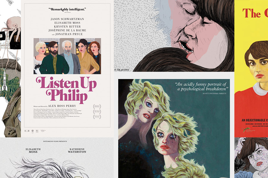
One evening, my girlfriend and I watched a movie called “Listen Up Philip”, written and directed by Alex Ross Perry. We pretty much stumbled upon it by chance, liked the plot, the cast, the trailer… and, of course, the poster! A very charming and illustrated one. The movie turned out to be a very pleasant surprise so the next day I started exploring the man behind the movie, Mr. Alex Ross Perry. Here was a fairly young (31) movie director (and screenwriter, and actor) with a few movies behind him that people apparently love. They speak of him like an emerging indie cinema hero with traces of Wes Anderson, John Cassavetes and early Woody Allen in his work. Having seen “Listen Up Philip”, I could only agree.
In the following weeks I watched the rest of his movies and, although Philip remained my favorite, I wasn’t disappointed. But another thing apart from the movies caught my eye: their posters — all of them illustrated, original, and with a more-or-less consistent style. This is seldom the case with movie directors and that made me want to find out the story (and artists) behind them. This blog post is the result of that little research.

Impolex
“Impolex” is Alex’s first movie; low budget and shot on 16 mm, it’s about a man trying to locate German V-2 rockets at the end of World War II — the plot follows a thread laid down in Thomas Pynchon’s novel “Gravity’s Rainbow”. It’s far from conventional storytelling and the experimental nature is nicely reflected in the movie’s peculiar, hand-drawn poster. The story behind it goes like this: after seeing and loving “Impolex” on Off + Camera Film Festival in Krakow, a Polish artist named Adrian Kolarczyk created the poster as fan art. He then contacted Alex on Facebook to shared his work. Alex loved his unique interpretation and immediately sent him the DVD of his next movie, “The Color Wheel”. This led to Adrian producing a new poster and several more pieces of artwork.

The Color Wheel
“The Color Wheel” is unusual road trip movie (again shot in 16mm, grainy black and white) that stars the director himself and his co-writer Carlen Altman as main characters, the dysfunctional brother and sister. It’s a comedy with a twisted sense of humor, fast dialogue.
Adrian’s interpretation again led to some unique artwork in his usual visual style. Apart from what seems to be the main poster, more pieces of artwork have been created (I’m not sure if or how they were used exactly).
While Adrian’s work was used for the festivals, Alex needed something less experimental for the theatrical run. That’s when he turned to the illustrator Anna Katrina Bak (also his fiancee). This was the start of an important collaboration because Anna would later create posters for two more A. E. Perry’s films (she also designed some tarot cards for “Impolex”).
The poster she created features the brother and sister characters on a solid yellow background. Their posing, recalling Grant Wood’s American Gothic, mixed with brave colors and slightly cartoonish style, gives a hint of the comedy genre (although a morbid one).

The swirly serif typography used for the title was something that immediately caught my eye, more so because I remembered something similar used in the artwork and titles for “Listen Up Philip”. A quick research led me to a literary connection: “The Color Wheel” is a tribute to Philip Roth’s fiction. One of the novels it’s most inspired by is “Portnoy’s Complaint”, whose first-edition paperback cover (designed by the great Paul Bacon) reveals itself as the inspiration for type, as well as colors. For further proof, here’s the book cover and an ad poster for the movie:

Listen Up Phillip

“Listen Up Philip” is Alex’s third movie (and my personal favorite) which got some major praise at Sundance. It’s about Philip, a selifish, boastful novelist (played by Jason Schwartzman) and his relationships with women and a famous writer that takes him under his wing.
The movie’s stylish poster has two recognizable elements from before: the swirly serif type in dark pink and Anna’s recognizable acrylic illustration (featuring Philip and other characters, giving him a deprecatory look). Only this time, instead of a full bleed illustration, there’s lots of white space and a thin frame around it. Credit for this elegant layout, reminiscent of posters from the 70’s, goes to Teddy Blanks from New York studio CHIPS.
Another version of the poster makes a bigger use of the illustration with overlayed type in white.

While watching the movie, I frequently felt the influence of Wes Anderson (along with 70’s Woody Allen). One thing that I found Andersonesque in particular (and that made the designer in me happy) were the fake book covers. A very nice touch and rare care for details in a movie.

Queen of Earth
Alex’s latest movie is “Queen of Earth”, a psychological drama depicting a deteriorating friendship between two wounded woman. This time it’s more Bergman and Polanski than Anderson and Allen. Elisabeth Moss returns, but now as the lead character, and also the main motif of the gorgeous illustrated posters. Again, it’s Anna behind the illustrations, and CHIPS doing the layouts and type.
As Anna shared in her interview for Posterboys, the poster for the French distributor is basically a concept sketch she made based on their simple wish to have Elisabeth Moss with tears down her face. They liked it and just blew up the original pencil drawing.
The other version of the poster was made for the American distributor, IFC Films. It was inspired by the “Repulsion” poster with Catherine Deneuve and the concept of having more than one head with different emotions, visualizing the protagonist’s psychological breakdown. After IFC agreed on the concept, it took two weeks of constant work to finish the poster.
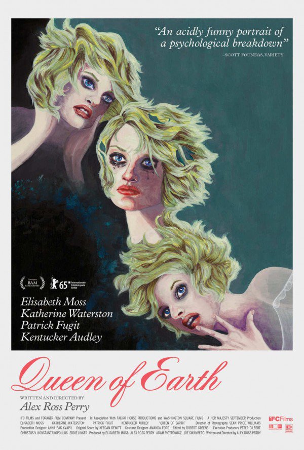
CHIPS did the layout and the typographic treatment for both versions of the poster which this time recalls the Rosemary’s Baby title card.
Final thoughts
I think it’s fair to say that the work collected here proves that Alex Ross Perry cares more than the average director about the visuals his movies are presented with, and that’s always great to witness (especially when the movies themselves are of good quality and carry a unique voice). As he is currently working on his next projects, I’m sure we’ll have some new material to discuss soon.
His collaboration with Anna Katrina Bak is certainly a significant part of that whole story (she also worked on set for every of his movies). As I was curious to find out more about Anna’s process, and she was kind enough to answer my questions, the resulting interview will be published in my next post.