My design process
This article is meant to give you an insight on how things would work if you asked me to design a movie poster for your movie.
Designers often need reminding that our clients are not designers themselves and could use a word or two explaining how we do our thing. The client might have an idea of the end product clear in his minds, but not the steps needed to get there.
Me being a one-man band, means my clients always get a custom approach with each new project we collaborate on. But also, that flexible journey from the initial brief to the final poster, is always made out of the same 4 steps - first contact, finding a concept, iterations and the final piece.
First contact
The very first step is usually an email I get from a filmmaker asking if I’m interested in making a movie poster. Before starting any work, I like to define the technicalities:
Deadline: the end-date for poster delivery
Deliverables: all required variations and format types of the poster (+ maybe a Facebook cover, an Instagram avatar, etc.)
Payment: the fee, date and payment method
In order to protect both sides included, these conditions are communicated by email, so there is a written proof of the agreement. But I must admit I have only dealt with amazing clients so far (how lucky am I, right?), where this kind of issues never arose.
And now, the more creative part of the story.
I always start by asking clients for a brief. It lets me know, described in their own words, what the movie is about and what central themes are being explored. After that, it all depends on what phase the movie is currently in. It’s usually one of following situations:
Finished movie
The movie is finished and the filmmaker is kind enough to send me a link to watch it. In addition to seeing the final product, this allows me to pick up on the atmosphere and visual style, see the actors in their surroundings, and, if needed, use certain shots (of people, buildings, objects…) as a reference for my illustration.In production
When the movie is currently in production and there is no footage available yet, I turn to the script—I read it a few times while my imagination does the rest. Unit photography, if existing, also helps to paint a more complete picture.Still writing a script
Sometimes the script is still in progress (and the finished movie is more than a year away), but the filmmakers know the importance of producing artwork early on for publicity purposes. In this case, I rely on the plot and brief given by the filmmaker. While this can sound tricky, it often gives interesting results, usually more abstract and simple, but all the more effective.
In addition to the brief, another thing I prefer having is a mood-board. It could be a secret Pinterest board shared with the filmmaker, or just a bunch of pictures we sent each other by email. In any case, it goes a long way in making sure we are on the same page, not just style-wise, but also on a concept level: are we looking for a more abstract or literal solution?

A mood board for one of the projects. Some elements are here because of their concept, some because of their visual style, and some are reference images for my own illustration.
That being said, filmmakers that contact me like (at least some of) my previous work, so staying within my usual style is somehow expected. Otherwise, they would hire the next guy whose style they prefer to mine.
Getting to work
Finding a concept
After gathering all the information, I start the poster design process by searching for a concept—a simple combination of visual elements that tells (or even better: hints at) the story. We could call this the brainstorming phase. In my case it happens during my morning commute, while ironing my shirt or vacuuming the apartment. Each idea gets a quick pencil sketch. While generating them, I’m constantly asking myself if each of them has the potential of:
being memorable
delivering a message
evoking emotion and curiousness

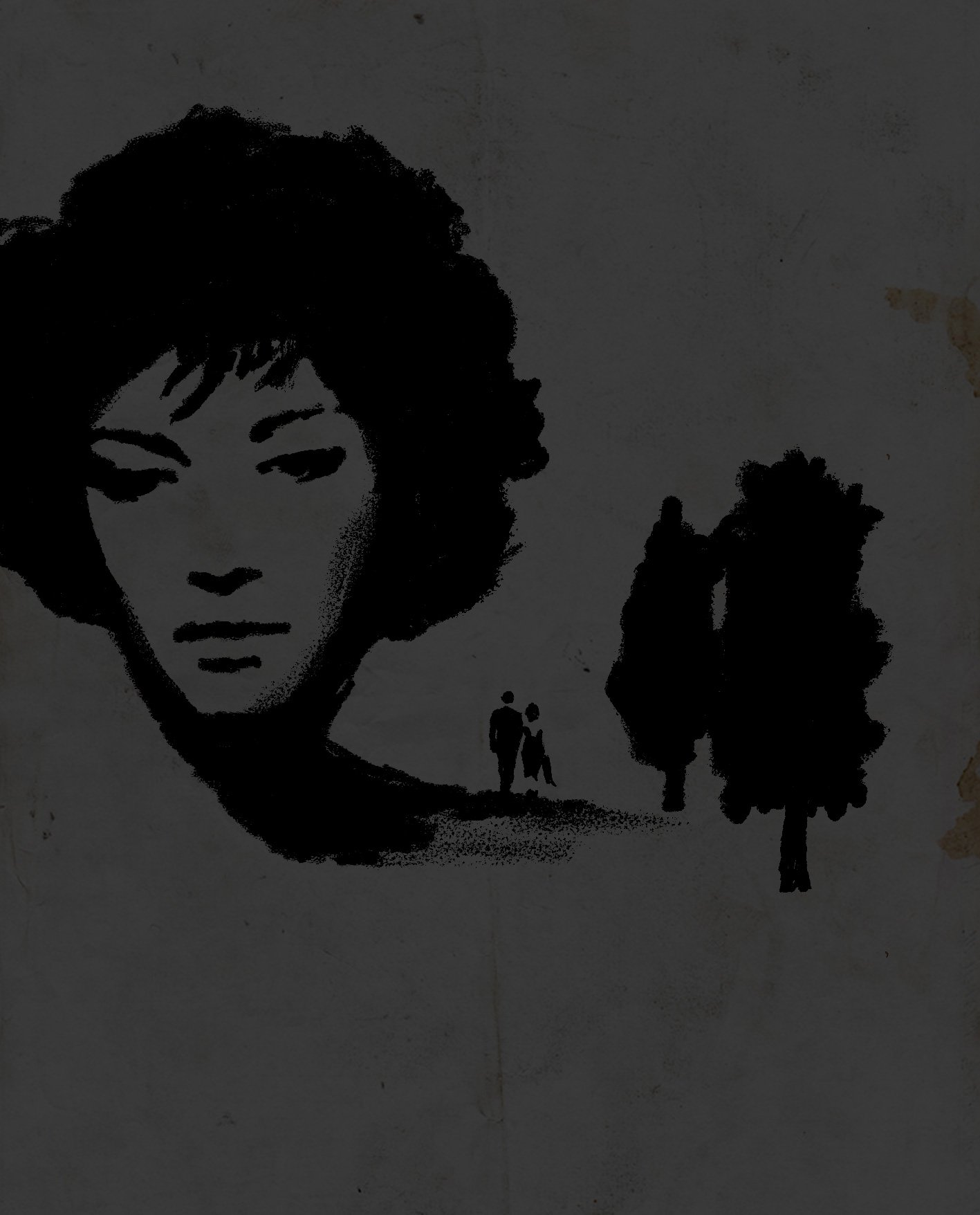
A spread from my sketchbook shows the early phase of exploring random ideas. This is for my eyes only…
When there are at least a few ideas I find worth exploring, I fire up Illustrator, my main tool, and start doing very basic poster layouts. After I have all my basic elements roughly drawn, I play with them like I’m doing a collage. This approach allows happy accidents, and that’s often when best results happen.
Although it’s too early for decisions about color and typography at this point, I like to make those rough layouts feel almost like real posters. That way I find it easier to evaluate the potential of a certain concept—and it also makes things easier for the client who sometimes can’t conceive a finished poster based on a rough pencil sketch.
This is where trying out some completely different things gets real quick and easy, so I really go wild and often end up with dozens of iterations. Afterwards, a few selected comps get sent to the client for feedback.
If all goes well and the client loves it, we have a winning concept! If not, I gather the feedback on what does and doesn’t work and go back to the drawing board, trying to come up with something that is a better fit. There could be several rounds of generating new ideas and getting feedback, but in most cases a solution is found within the first two. Good communication from both parties involved is often crucial in getting there without losing any extra time.

A first round of comps for a short film called Bricks. From them, the director chose several elements he wanted to keep exploring—bricks, hand with a masonry trovel, glass and the red puddle. Already visible in some comps is the title design that changed only slightly in the final poster.
If things are lucky, client loves it and we already have a winning concept! If not, I gather the feedback on what does and doesn’t work and go back to the drawing board, trying to come up with something more appropriate. There could be lots of rounds of feedback, but in most cases a solution is found within the first two. Good communication from both parties involved is often crucial in getting there without losing any extra time.
Iterations
Having chosen a concept, it is time for details. Once again I fill up my Illustrator artboard by exploring different color palettes, type treatments and layouts combinations. The more specific the client is on what he wants visually, the more focused that exploration is.
If two completely different concepts are a potential fit and the client cannot decide which one to go with (it does happen) I work on both, until he decides on a winner. More time is spent that way, but a lot of potential ‘what-ifs’ are avoided.

A selection of iterations for the Bricks poster. While all the elements were already here (except the billing block and tagline) and the color scheme was pretty much defined, we were still searching for that final layout that looked just right.
Final piece
When the job is almost finished, it’s time for those small details that often have the power of transforming a good poster to a great one: applying texture, customizing a font, or making the billing block extra neat.

An example of using texture on the A Stray Ember poster.
After that, it’s all about generating the deliverables that the filmmakers need—a pdf ready for printing, a smaller files for web use and any extra materials for marketing campaigns.
No two projects have ever been exactly the same, but if you’re wondering how long all this can take, a good approximation would be from 3 to 6 weeks. A lot of it depends on the availability of the filmmaker for discussions. If he’s busy shooting, that can stretch the whole thing by another week or two.
I realize this seems pretty long and is the opposite of the design agency way (churning out dozen of posters a week), but I guess that was the whole idea in the first place—filmmakers that hire me want their posters to be a unique artistic interpretation of their movie, not a data driven sales tool. So we take our time to create the magic.
This is how movie posters are made at my personal studio. Have some more questions on stuff I didn’t cover? Curious what it all costs?
Shot me an email and we’ll talk!
