What should every graphic designer know about Gutenberg's Bible?
When Gutenberg’s Bible was printed in 1455, it changed the world. Although it wasn’t the first use of moveable type (that happened in East Asia), it started the age of printed books in the West which soon made them more affordable to wider parts of the population, enabling people to follow debates and take part in discussions of matters that concerned them.
Its historical significance is therefore unquestionable — no history class would fail to mention it. But what could we say about this book in a graphic design class? I believe that exploring its typography and layout will give us an insight into Gutenberg’s thought process, decisions and creativity within many limitations. And maybe tell us why is his Bible justifiably called a typographic masterpiece.

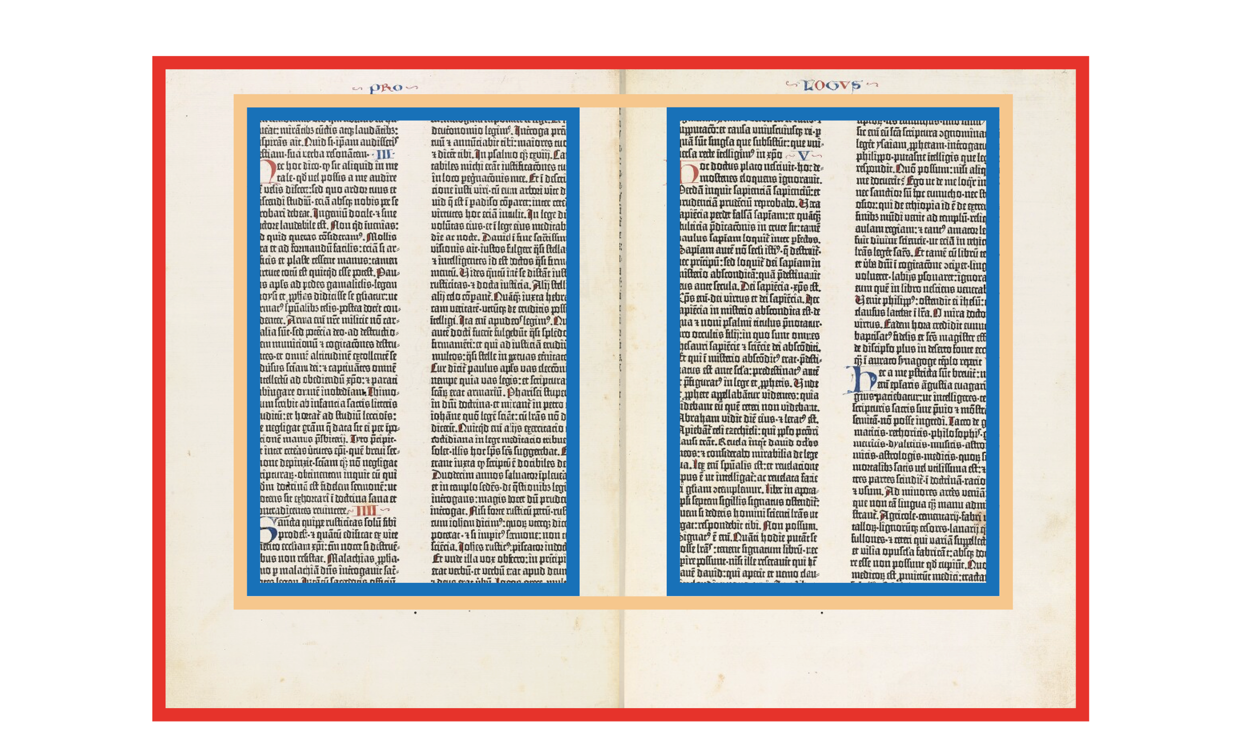
A spread of Gutenberg’s Bible. Illuminations and text in red (rubrications) were added by hand after the printing process, at the expense of the purchaser. Initially Gutenberg experimented with red printing, but soon abandoned the idea as it was too time consuming. https://dpul.princeton.edu/gutenberg/catalog/7d278t10z
Typography
It’s worth noting that, in the early days of printing, even though new technology was available, size and appearance of printed books still very much derived from the manuscript tradition. This meant large, clumsy to handle formats with dense typography. The reason was a business one — making sure the books, which were a huge financial investment, would sell. Gutenberg didn’t want book buyers feeling any resistance to his new invention.
Making his moveable type satisfy an audience used to handwriting (which medieval scribes brought to perfection) certainly wasn’t an easy task. He set the type in two narrow columns, forty-two lines each (that’s why it’s known as the “forty-two-line Bible,”) and based his type design on “Textura”, a commonly used script. This condensed lettering also helped reduce the materials needed for production.
But one special challenge was figuring out how to do proper justification, keeping all line lengths exactly the same without spaces between words getting too wide. A task which is a bit harder to do on a letterpress than in modern software. This is why, instead of just making 26 lowercase and uppercase letters, Gutenberg produced a total of 290 glyphs (around 16,000 individual pieces of type) — a set which included dozens of abbreviations, ligatures and letter variations, all tools to help him achieve a more balanced typeset.

Glyphs used for the 42-line Gutenberg-Bible. https://de.m.wikipedia.org/wiki/Datei:Die_Typen_der_42zeiligen_Bibel.png
Abbreviations
Abbreviations were common in Latin and scribes used them to save time. With Gutenberg, they became a way to optimise justification in manual typesetting, a practice which lasted until the 17th century. Abbreviations varied in length; while some saved only a single letter, some saved five or more. In this way, he could precisely get the desired line length. The Bible is a highly abbreviated text, but frequency of usage largely varied. Here is some interesting data:
A total of 10217 lines of text have no abbreviations
4 lines have as much as 9 abbreviations
There are in average 147.6 abbreviations per page
Ligatures and letter variations
Ligatures — special combinations of two letters — were also a good way to achieve flexibility and a more unified composition. A total of 60 ligature glyphs were made to print the Bible. Additional elements in the type case were lowercase letters with variable width and connecting letters (cut off on their right side, so that a following letter could be placed closer).
Punctuation
A feature known to today’s designers from modern software as “optical margin alignment” was also something used to achieve the typographic excellence of the Bible. This alignment outdents certain elements (mostly punctuation like hyphens) into the margins so that the text border looks optically aligned.

Detail of the Bible. Hanging punctuation (hyphens and dots) is visible on the right edge, as well as different abbreviations (words with a line above them).
All this shows Gutenberg’s dedication in producing a technically superior product while also replicating the distinctive handwritten feel of manuscripts. Next, we’ll explore his choices of layout.
Layout
As a designer, I’m always interested in how things were put together — if there’s an invisible grid, holding all the elements together in a deliberate (or even mathematical) way? It’s no surprise that Gutenberg didn’t improvise when making a layout of his monumental Bible project. Instead, he relied on something that’s been practiced for centuries before him: sacred geometry.
Bible is definitely not a bad place to use sacred geometry. In this case, a combination of three basic proportions were used:
root 2 rectangle
3:2 rectangle
phi (golden) rectangle
The cool thing is that all of these can be derived from the square. Here’s an illustration showing this simple process where just a ruler and a compass are needed.

A root 2 rectangle, with a ratio of 1:1.414 (a long established proportion for medieval paper sizes) was used to define the Bible’s page size, as well as the opened spread. A nice property of root 2 rectangles is that they keep their proportions when divided in half (e.g. when you fold an A3 paper, you get an A4). Each page in the Bible measures 280.6 x 400 mm so 400/280.6 gives us 1,42.
The size of the two-column text blocks is 292 by 198 mm. Dividing those numbers gives us roughly a 1.5 ratio (3:2). It’s interesting that, although the printing process already started, the number of lines per page was increased from 40 to 42 (presumably to save paper), but the increase in line number was achieved by decreasing the interline spacing, rather than increasing the printed area of the page. This kept the proportions intact, which was apparently important to Gutenberg.

This is where the divine proportions come into play: the position of text blocks on the two-page spread is locked inside a golden rectangle (whose ratio is 1:1.618). The result was an elegantly balanced composition with comfortably sized margins that allowed illuminated decorations to be later added by hand (the Bibles left the print shop as unbound pages with a list of instructions for rubricators to follow).
Gutenberg’s Bible two-page spread with all the proportions overlaid.
Conclusion
It seems that all the trouble Gutenberg went through did in the end demonstrate a success of the printing invention. There was no immediate explosion of this technology in the following decades (handwritten books continued to be produced), but for the first time a book gave people, which were quite far apart, the opportunity to refer to virtually identical copies of a major text (what we now call an edition).
He also succeeded in making his Bible a highly desired product — although very expensive, intended only for the wealthiest buyers, all the copies quickly sold (around 180 Bibles were printed). Today, with only 48 copies surviving, a single page from the Bible is estimated around $500.000. Neither the paper nor the vellum has yellowed or turned brittle and the ink is still a deep black (this was yet another of his inventions; his oil based ink contained high metal content which made it appropriate for letterpress use).
All this is a testament to Gutenberg’s various talents — as an inventor, craftsman, salesman and artist. Despite this, the 42 line Bible didn’t make him a rich man. But that’s a story for another article…
If you’d like to browse through Gutenberg’s Bible without spending millions, Princeton University Library offers a detailed scan.
Sources
Nevidljiva tipografija by Frane Paro, 2012
Povijest knjige by Aleksandar Stipčević, 2006
Tipografski priručnik by Franjo Mesaroš, 1985
Johannes Gutenberg and the printing press by Diana Childress, 2008
https://www.fontfabric.com/blog/gutenberg-first-typeface-original-bible-typography-used
https://finaltype.de/en/topics/gutenbergs-justification
https://www.gutenberg.org/files/30804/30804-h/30804-h.htm
https://www.bl.uk/treasures/gutenberg/homepage.html
1 Likes