Finding the invisible in movie posters
Grids are hard to avoid in design. Although some people nowadays offer advice on breaking (or forgetting) the grid, it’s been a useful tool for a long, long time. And not only in design—art, architecture and handwritten manuscripts have relied on grid to provide structure even in Ancient Greece.
Apart from structure, geometry was used to achieve visual balance and beauty—things which, one could argue, have been more important 500 years ago than today. Art/design schools of today offer little insight into complex proportioning principles and browsing online for guidance seldom goes beyond the rule of thirds. Still, that doesn’t mean we can’t find these design principles appearing around us, even in a modern medium like movie posters.
Searching for a system
As a movie poster designer, I wondered if some visual “rules” could be found to explain (or even deepen) my appreciation for certain artworks. Golden section was something I was familiar with, but I wasn’t sure how to use it for composition analysis. Stumbling upon a system called “dynamic symmetry” set me on the right path; it’s a proportioning principle named and described by Jay Hambidge which he observed in ancient Greek and Egyptian art, as well as in nature or the human body.
“Design created within rectangles which do not possess dynamic symmetry, the qualities of life and growth, are always flat and dead.”
Jay Hambidge
It’s based on dynamic rectangles (just as static symmetry is based on static rectangles) whose subdivision produces a series of visually pleasing ratios of surfaces. Subdividing process is simple and includes a combination of diagonal, parallel and perpendicular lines. The resulting grid (armature) turns out to be a convenient tool for organising harmonious compositions and achieving unity and movement. Artists used it throughout centuries to build all kinds of masterpieces, either consciously or intuitively, so immediately my ambition was to try it out on some movie posters and see if it fits.
Dynamic symmetry
A lot has been written about how dynamic symmetry armature is created both in books and online so I won’t go into details here (although I urge you to check out the resources section at the end of this blog post to uncover a more complete story and some fascinating geometry principles along the way).
Before we start overlaying posters with a bunch of lines, let’s get familiar with the basic armature elements. As Hambidge writes in his book, “for purposes of design the most important element of a rectangle is its diagonal”, so it’s no surprise that the starting point of any armature is the main diagonal of a rectangle. After that, dozens of lines and points can appear.

Dynamic symmetry armature with elements we’ll be using in analysis.
A) Main diagonal with a reciprocal diagonal that cuts it at right angle.
B) Both main diagonals with four reciprocal diagonals. This is the basic armature.
C) Vertical and horizontal lines added—any places of intersection are called eyes.
D) Locked points—elements placed near intersecting lines.
E) Added lines can be created by connecting eyes.
Since the dynamic symmetry armature is not a one-fit-all solution, but specific for each dynamic rectangle, I had to take into consideration the ratio of each poster selected for analysis. If the chosen rectangle with his corresponding armature and artwork are not compatible in size, the integrity of dynamic symmetry is violated. In short—cropping is not allowed.
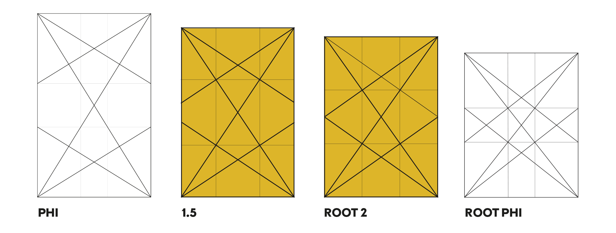
Turns out, most of the posters I chose were using a 1.5 rectangle (which is basically a square and a half), while some used a root 2 rectangle (the basis for European DIN system of paper sizes, so it’s common for posters from Europe).
Finding the grid in movie posters
I wanted to include examples of a wide array of movie posters, created across decades and by (very) different artists. It needs to be said that even though the armatures are based on the exactness of math, it’s a tool that can be used in different and creative ways, so the resulting analysis is subjective and always just one of many possibilities. You may have a different view on things, arriving at different conclusions and discoveries, which is what makes this all the more exciting.
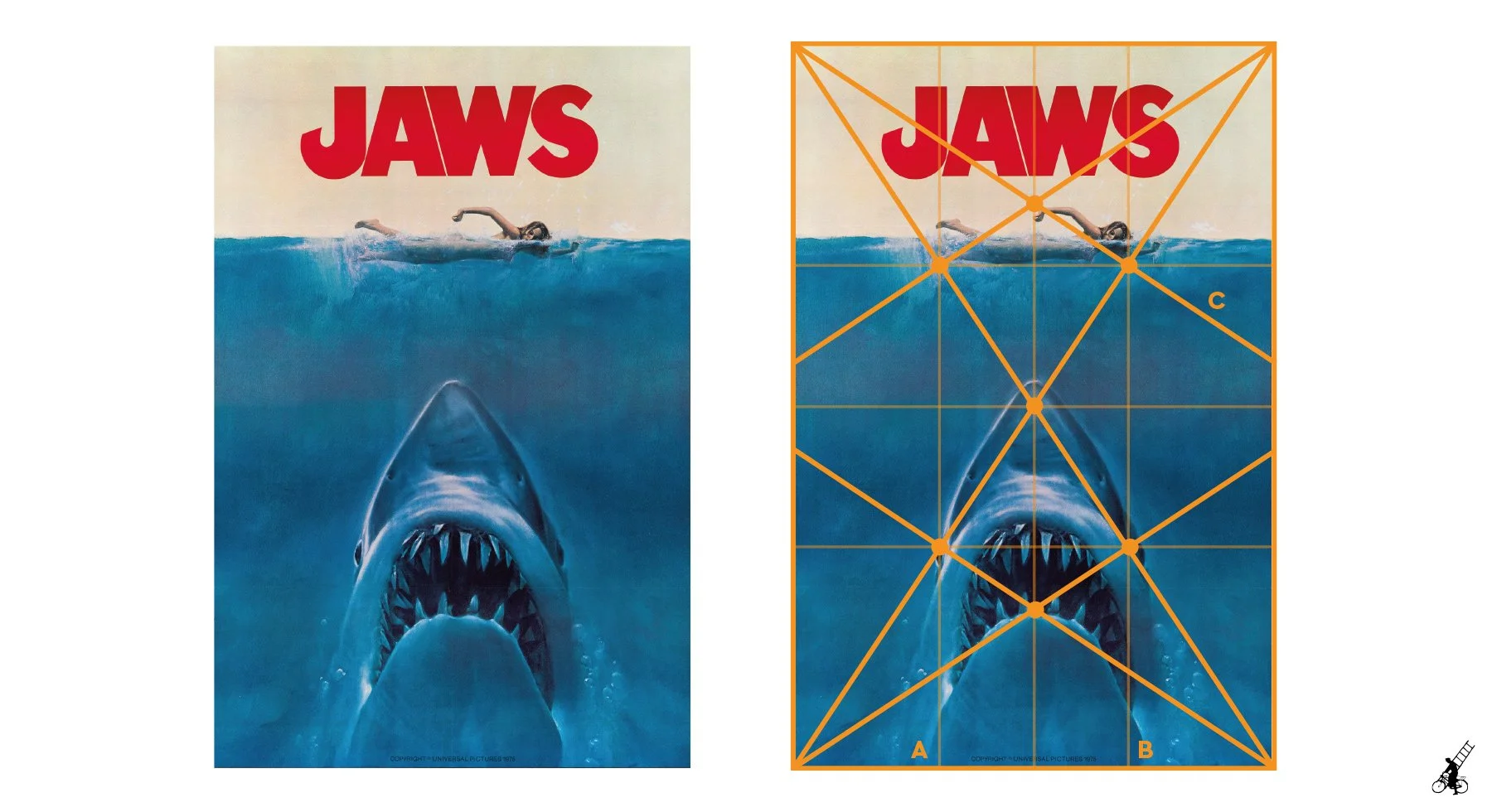
Jaws (1975)
Designed by Roger Kastel
Let’s start with a classic. Jaws is certainly one of the most recognisable movie posters ever (it was based on the Jaws book cover). Its rectangle has a 1.5 ratio, so when overlaid with dynamic symmetry armature, we can immediately spot some obvious overlaps.
Main diagonals define the shark shape and position.
Both the shark and the swimmer are in the central part of the image, enclosed within vertical lines A and B.
Eyes (orange circles) on the bottom part of the armature exactly match the shark’s eyes/mouth/tip of the nose, while those on the upper part define the swimmer’s figure.
Swimmer’s arm lines up with diagonal C.
The title sits nicely on top, enclosed by diagonal armature lines.
Overall, Jaws looks like a poster well defined by its dynamic symmetry armature. Maybe one of the reasons it stayed relevant for so long?
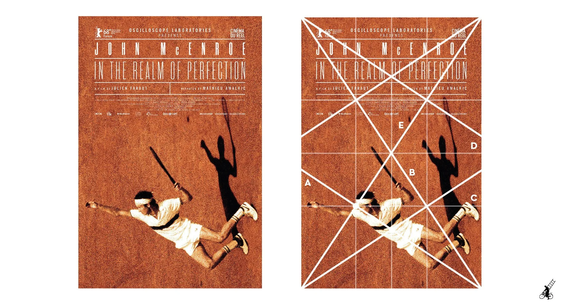
John McEnroe: In the Realm of Perfection (2018)
Designed by CheckMorris
This poster’s unconventional use of tilted photography makes things more interesting and also locks nicely with its armature. Let’s take a closer look.
There’s only one eye “in use” here, but it lands exactly on McEnroe’s forehead, while his head is nicely locked between intersecting diagonals.
Diagonal A lines up with McEnroe’s body, while B is parallel with his left hand/racket.
Horizontal line C connects his left foot with his shoulders, right hand and the direction of his view.
Horizontal line D divides the poster in half, placing the player on bottom half.
Last, but not least—shadow of the tennis ball touches diagonal E.

The King (2017)
Designed by Brandon Schaefer
We’ve exchanged the tennis racket for a guitar in this example. Quite a bit of armature overlap gives this poster a very pleasing composition.
Diagonal A lines up with the guitar, taking it visually into the upper right corner.
Connecting intersections creates horizontal line B on which festival laurels sit (that Cannes laurel is very careful not to touch the diagonal).
Line C closely follows the horizon behind which the sun is just setting.
Horizontal lines D and E are dividing the bottom part into sections we can call car/title/billing block.
Vertical lines accurately frame all the main elements in the middle: Elvis silhouette, car and title.
I felt this is a good place to use some added lines and I didn’t regret it because F and G diagonals (dashed lines) follow the leg split very closely.
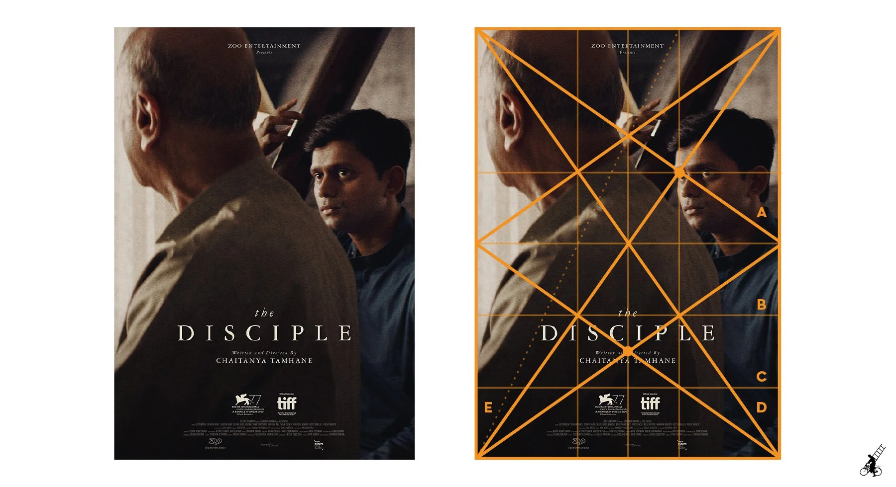
The Disciple (2020)
Designed by Midnight Marauder
This poster is our first example of root 2 rectangle. You’ll notice a slightly different armature than before which divides the poster exactly in thirds, creating nine smaller root 2 rectangles.
Our first point of focus could be the eye (yellow circle) on the intersection of diagonal A, marking the actor’s right eye. The second one leads our attention to the title.
Horizontal line B encloses the bottom part where title, festival laurels and billing block are placed.
The actor closer to the camera can be defined by diagonal C (his back and head).
Added line E played her part here as well, lining up with the diagonal structure in the background, but also the front actor’s arm and shoulder.

La French (2014)
Designed by Akiko Stehrenberger
Back to ratio of 1.5, this illustrated poster gives us plenty of details to work with.
Four eyes marked in the armature are placed on Jean Dujardin’s forehead, the group of people on bottom left and on the person standing in the middle.
Looking at the diagonals, we could say that the main character is defined by A, B and C.
Diagonal D starts with Dujardin’s hand, frames the group on bottom left, traces the bullet trajectory/smoke and finally lines up with the unfortunate man laying on the floor.
Names of actors are placed tightly inside the area defined by horizontal line E and intersecting vertical.
Horizontal line F defines the horizon.
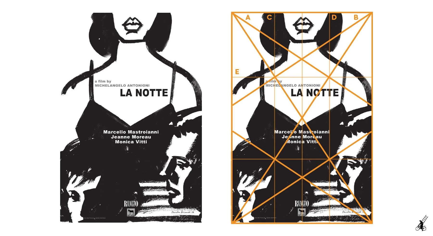
La Notte (1961)
Designed by Keiko Kimura
Another illustrated poster, but much simpler, with heavy brushstrokes. La Notte is a love triangle story, and it’s interesting how these characters are laid out.
Jeanne Moreau’s figure dominates the poster and we can see that diagonals A and B run in parallel with her shoulders.
The middle vertical cuts the poster in half (from Moreau’s lips down to the Rialto logo), but verticals C and D separate the characters, while also defining the width of actor’s names.
Horizontal line E is used to anchor the director’s credit and title elements.

Der Golem, wie er in die Welt kam (1920)
Designed by Johan Brosow
New design for a silent era classic, Der Golem layout relies a lot on diagonals, achieving visual impact and making use of root 2 dynamic symmetry.
While diagonal A roughly marks the Golem’s angle, B lines up with the girl he’s holding.
Diagonal C creates a triangle that separates all the typography from the illustration.
Bottom third is defined by D which also marks a border for the title.
E and F verticals hold both faces inside the middle third, but we’ll also notice that the logos bellow the billing block also align exactly inside it. Another obvious function of F is defining the girl’s back.
Apart from the basic root 2 armature, we can add lines G and H to define additional edges of the girl’s dress.
Conclusion?
I hope these seven examples give you a taste of what can be done with dynamic symmetry (or generally with geometry) in design, painting, photography and other visual arts. If you’re a creator, this is a tool you can ignore or use to your advantage. If you’re a movie poster lover, maybe this will bring you an additional level of appreciation for the medium.
What’s certain of this analysis is that it’s just a tip of an iceberg which means that there’s a ton of things to discover underwater. Apart from the all-knowing Google, a good place to start are books so just scroll a bit more to find ones that helped me in creating this introductory blog post.
Resources for further research
The Elements of Dynamic Symmetry by Jay Hambidge
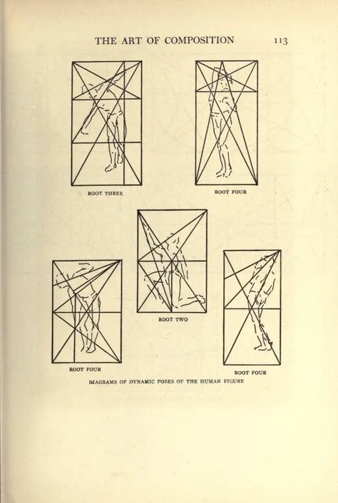
Available for free on archive.orgThe Art of Composition: A Simple Application of Dynamic Symmetry by Michel Jacobs
Available for free on archive.orgGeometry of Design by Kimberly Elam
Dynamic Symmetry: The Foundation of Masterful Art by Travis Leaf Glover
Harmonic Armature by Thomas Kegler
Available for free on scribd.com